Once I decided on the chosen perspectives I exported all the files as PNG’s and edited them in Illustrator. I altered the page layout by ensuring that the plan was in the centre of the page, this wasn’t difficult because I was able to use the rulers to make everything equidistant. I want all three pieces to flow together nicely so I included the same sized border and made sure that the typeface was the same size and colour throughout. I used a charcoal grey as it was less harsh than jet black and it complimented my work better. The typeface I used was Myriad Pro in the size 12p, I chose this typeface because it had the right weight to it, as I didn’t want the text to be bold and heavy as this would have looked out of place with the thin lines of my designs. Myriad Pro is a sans- serif typeface and I prefer sans- serif to serif in this context because it looks more modern, if my work was primarily typography then I would coincider using a serif font.
Reflecting back to my primary research, the textures and materials I chose to use are fairly similar to the ones I intended to use. The few parts that I decided to alter were the feature wall, rug and artwork. For the feature wall, I was aware that I wanted a natural texture so I decided on a brick wall, I got the inspiration from when I researched into typical ’50s and 60’s living rooms, and there was a grey stone wall which worked well with the colour scheme and overall appearance of the living room. The rug I chose is of pastel and geometric scheme which complements the mixture of tones in the wood flooring. Even though I intended to include geometric art I still incorporated geometric designs in the rug. I originally planned to include multiple pieces of artwork, however, I found that one large piece of art looked more appealing, especially with the large plant that I included. Instead of adding more than one piece of art, I added a large mirror to fill up wall space. The mirror gives the impression that it is vintage, with the metal used and the style of the frame. I wanted the window and door frame to be black as this isn’t common in interior design because they mostly use a white gloss. If I was to use white then I think that the room would be too bright, this wouldn’t help me create a warm-toned living room.
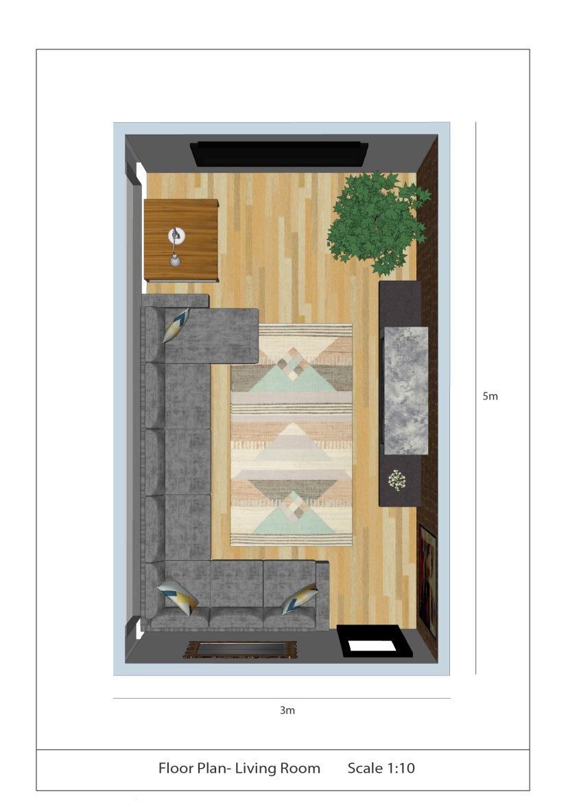
From looking at technical dimensions I decided that I was going to include a bar at the bottom of the page with more information to help explain my design better. The scale is so that the viewer can visualise how it will look in person. I also included the length and width of the dimensions to make my work seem more professional.
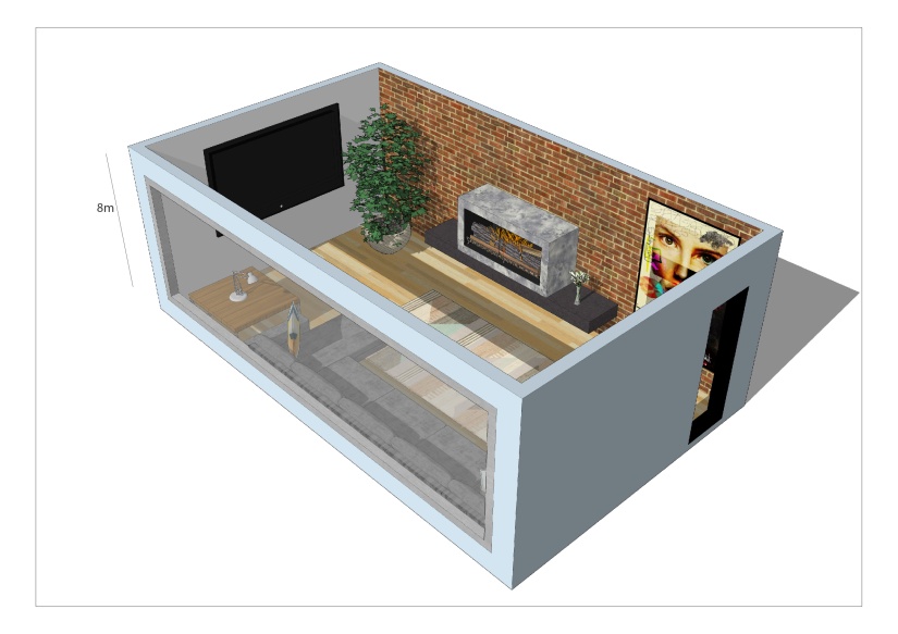
For the landscapes, I decided to add a shadow effect to create depth and to help further show the window by having the light passing through. Also by having a shadow you are able to see that the living room is north facing. I included the height of the building to make my designs seem more realistic.
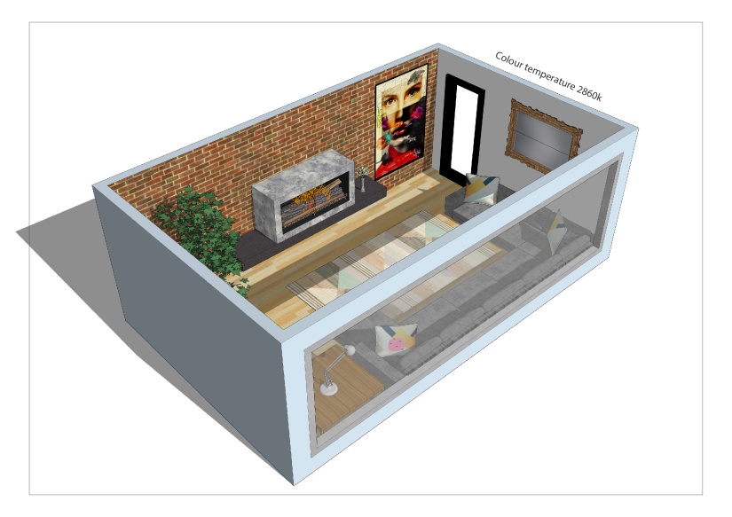
I included the colour temperature to show that I want the room to be warm-toned as I am unable to convey to colour through the daylight effect that I have added.
