Unit 13 research

Colour temperature lighting


Image result for colour temperature lighting

I have decided on having the colour temperature at 2860 k. I chose this because I want extra warm lighting if I chose 1000 k then this is the equivalent to candlelight and this would be too dark.

“This colour temperature is pure mood lighting, which creates an atmosphere like candlelight. It can be used to create a more relaxing or romantic setting. Keep in mind that the traditional incandescent bulb has a colour temperature about 2700K.” I got this from an article on professional lighting and this has reassured me that my colour choice is the best for the atmosphere that I am trying to create because I want to portray a cosy environment. The main activities that will take place in the living room are watching T.V  and lounging on the sofa with friends and family, therefore, this helps to create a warm and safe environment.

Image result for colour temperature lighting


Unit 13 research

B&Q


My preferred style of lighting is energy saving because it is warmer and also will save money. If I was to use a fluorescent light this will make the room look clinical like an operating theatre, this doesn’t create a comforting feeling for me so I definitely won’t use fluorescent bulbs. I am certain that I will have access to direct sunlight from including a large window, as well as making the living room north facing, so that the sunlight will enter directly through the window, lighting up the room. Something to consider is the colour sample I chose to use because it will make the lighting seem unflattering if I was to use a deep purple for instance. I chose a burnt orange which helps to make the room look warmer.

20190417_124800

For the walls, I will use a light composition instead of a bright colour because this is more to my personal taste. I am not keen on aquatic colours because they can make the space seem cold, also because I associate blue with water, therefore, I would use it in a bathroom. I have decided that I will use an off white paint for the walls because this will match the light flooring that I am planning on including. I have yet to decide on the type of finish that I am after but my usual go to is matte because it is easy to apply to the walls and it creates a nice finish. I might look into testing out satin’s and glosses as a comparison between the finishes and how easy they are to use.

20190417_125242

I prefer the wallpaper when the print is larger, if I was to use this for my feature wall then I think it would be an eyesore because it looks like an optical illusion and the pattern looks busy. Therefore I am not using this pattern. I was originally drawn to the wallpaper because of the metallic effect, even though I am not using this wallpaper I can create the same effect with metallic accessories like a painted vase and a metal light fixture. I can also take into small details like having metal legs on the sofa and coffee table. The texture of the wallpaper resembles polystyrene and doesn’t work very well with the mundane texture of the gold.

20190417_125304


20190417_125636

This wallpaper also looks better up close like the other. I chose this because he hexagons fit nicely with the art pieces, which I am going to create. The background looks as if it has been made with watercolours. I like the brush strokes on the pattern because it adds depth to the overall appearance. I am fond of the light colour scheme because it looks delicate and also has a marble effect. Therefore it will complement the marble fireplace that I am including.

20190417_125621


20190417_131435

I like this light fixture because it looks like a candelabra with lightbulbs instead of candles, which is what I originally planned on using. The paint that has been used for this light is cream and also creates a rustic feel by having the paintwork distressed. I also like the leaves entwined along the arm because this incorporates nature and it will work well with the plants that I am going to include.

20190417_131602

I like the shape of the lights but I don’t like the harsh fluorescent lighting however I do like the ability to change the colour with the remote. I am impressed with the range of colours available, this means that you could change the settings depending on the mood that you are trying to create. I love that you are able to change the lighting in so many ways. I, personally, enjoy the mix between modern and vintage in interior design with the vintage appearance but with modern technology, like the T.V and the lights that can be controlled by a remote and even a mobile phone. I would like to include the ability to change the lighting with this technology but by using a different style of light fixture. I don’t like the size of the light because they look too large for the magnitude of the room.

20190417_131616


Unit 13 research

Ikea


20190410_173913
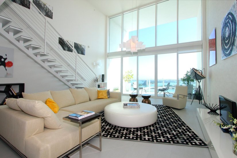
The corner sofa will be one of the main focus points of the room because I want to be able to feel comfortable and a large corner piece is one of the best ways to portray this. I am certain on including this style of settee and I am likely to choose a neutral toned sofa so that the range of complimenting colours is of a broader choice. I will also include bright and plump cushions, which are likely to be stuffed with duck feathers which is more of a personal preference. I like this style of sofa because of the material which looks like cotton and is also very soft, including the cushions. Even though I like the overall appearance of the settee, I think that the scatter cushions on the right-hand side are too clustered and there aren’t enough on the left-hand side. When I add pillows to my design I will have them spaced out from one another because they look visually appealing.

20190410_173653

I chose this showroom primarily because of the textured feature wall with bamboo, also because of the warm-toned lighting. For my living room, I would like to add a feature wall however I haven’t decided on the texture but I would like to use natural material to create the authentic vintage living room with some modern elements incorporated as well. I will also include warm-toned lighting to create a feeling of comfort and tranquillity in my ideal interior design space. I don’t like the paper lampshades because they are low hanging and I dislike the appearance of them. I also think that they are too large and use up too much space. Instead, I will use a light that resembles a candelabra or a chandelier.

20190410_174327

I like the placement of the plants, although I don’t like the harsh spotlight lighting and I would prefer them if there was natural light as opposed to artificial. I would have the verdures on a floating shelf or on the floor if it was any bigger. I think that the wooden basket and the plants work well together because they look natural and that is something that I am trying to incorporate into my designs, even though the foliage may be fake they still create the same effect, therefore, I will use greenery to bring colour to my designs.

20190410_180926

I am naturally drawn to floral patterns and in Ikea, they have a wide range of fabric in their ” Creative Hub”, including the opportunity to create mood boards by using a camera that is connected to the computer and these are some of the patterns that caught my eye.  Out of the two patterns, I prefer the larger print because there is more detail in the flowers and leaves. If I was to use this material I would make scatter cushions for the sofa to add character to the living room, this will create a contrast between the plain settee.

20190410_180706

I chose this pattern because it reminds me of the style “Geometric Abstraction” which was popular in Wassily Kandinsky’s work during the early 1900s. I like the irregularity of the sizes and colours used, this suggests that the pattern is random and fun. I think that the settee is will compliment the boldness of the material. As a result of this, I can create scatter cushions with my chosen material. The only thing that might be an issue is how thick the fabric is. This could make it hard for me to sew into because the needle may not pass all the way through. Also due to the tension from the sewing machine, this could cause the fabric to gather and create an unprofessional appearance.

20190410_183015

I like these pictures individually and as a trilogy, because they have the same techniques being used. They follow the same theme, which is a landscape with text over the top. This reminds me of the deconstructing images workshop I completed earlier this year. I will be including artwork into my designs and this is the art style I would like to use, which is Art Deco. I will also be creating these designs myself instead of using somebody else’s work because can create a design which best fits my colour scheme which I have been inspired by from the framed artwork. At this point, I am unsure of the orientation and size of the work that I am going to create but I will make three images and decide on which are the strongest and go from there.

20190410_183255(0)

I like the light because it doesn’t hang too low and the lampshades help to create the warm-toned lighting that I am after. Although I am not keen on the colour of the ceiling because it looks like wall plaster. Overall, I think that the room is too dark, especially with the black bookshelf. So, I will ensure to use light colours on the walls and ceiling to help reflect the light. This style of room reminds me of the Victorian Era and I don’t want that style, I intend on creating a twist on the modern living room with some key vintage design features, such as a textured feature wall with a fireplace.

20190410_184450
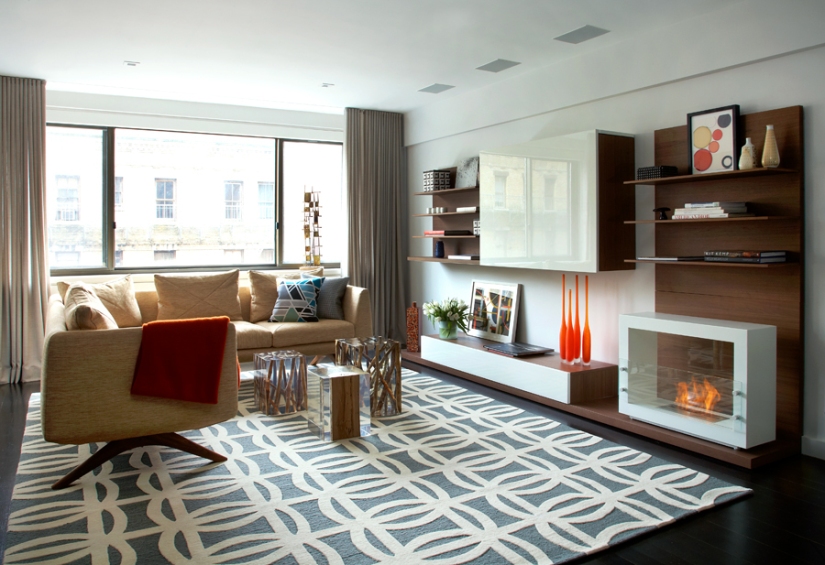
For the fireplace, I will use “White Marble 40” with “Black Stone 33” for the shelf that the fireplace will sit on. I chose these two textures because they will look nice alongside one another. I chose a charcoal grey because it is less harsh than jet black and because I want my interior design space to be bright. The darker the hue, the more light that is being absorbed by the dark instead of being reflected by the lighter colours.

Unit 13 research

Sarah Bax

As part of my primary research I reached out to Interior design lecturers at Southampton Solent University as I am enrolled on the Undergraduates course and I could gain valuable information which would help me in my project.

I started off with emailing the course leader, Sarah Bax, as well as other lecturers that teach the same subject. However Sarah was the only one who was able to answer the questions I was asking, this is because the other lecturers specialised in other areas of interior design like ergonomics and the history of interior design.

I also emailed a wide range of profession interior designers to see how everyones answers differ, however, I emailed them almost a month ago and I still haven’t got a response. I think that the answers I have received from Sarah as well as my other primary research should be plenty.

These are the questions that Sarah responded to:

How did you get into the interior design industry?
I started as a junior interior designer in an architects which inspired me to go into the industry.

Do you prefer working in domestic or commercial interiors?
Commercial is more exciting but there are certain regulations for fire and disability that you have to be aware.

Do you have any interior designers that influence your work?
Not so much interior designers but architects like Louis Khan, who uses daylight in his architectural interior design.

Do you have a particular art style?
Contemporary modern mixing old with new is my favourite.

Do you have any advice for an aspiring interior designer?
Interior design is such an interesting, always changing subject. If you are lucky enough to get into the architectural interior design field like I did this opens more doors and is more interesting than just styling an interior. I liked it so much I set up two businesses and teach the subject, if I can do it you can also if you put your heart into to.

I appreciate Sarah’s response and this has given me the insight into my chosen career choice. Before her response I have never considered architectural interior design and now this could potentially be a new career opportunity after university.  This has also given me an architect to research and if I like their style then I can include further research and use them as part of the progression in my project.

Unit 13 research

Mood boards

Screen Shot 2019-04-04 at 11.41.49.png

This is a collection of interior design elements that I enjoy and would like to consider in my final pieces. I enjoyed this exercise because I could see what works well in the industry from the perspective of professional interior designers. From creating this mood board it is apparent to me that I prefer natural light to artificial light so I will include large windows. I also like the appearance of neutral colours as well as accent pieces such as artwork. This has made it easy for me to visualise how I want my final designs to look.

Screen Shot 2019-04-04 at 11.42.56.png

This mood board consists of design elements that I dislike, this is mostly because the patterns and colours are too bold and extravagant for my particular taste. This helps me to visualise how I will piece my living room together by looking at the magazines that I got the images from.

Unit 13 research

7 elements of interior design

Space

Space Planning

Space is how you are able to arrange furniture in a room. The placement of the furniture is used to make the living room functional, from the image I can see that the sofas are positioned towards the T.V with the coffee table in the middle. Another way that they’ve utilised space is by having the bookshelf built into the wall, this allows more floor space for a walkway or to place furniture.

Line

Lines

By using lines this creates a feeling of peace and harmony within the space whilst defining shapes and focusing your attention to these areas. The horizontal lines are often associated with furnitures like tables, beds and chairs. Vertical lines create a free environment and diagonal lines often cause a contrast because it can interfere with the appearance of the harmony.

Form

Forms

Form means shape within a space, the two types of form is geometric (man-made) and natural (organic). You can create form by using different shapes and adding texture, patterns and colours to accentuate them. The form is geometric, although it is mostly made out of wood because it has been manipulated to look like this. This is likely to be by steaming the wood so that they become malleable and can bend easily. The table and the chairs are also geometric and I believe that this is an image of a coffee shop because the lights are in the shape of coffee beans as well as the tables.

Light

Light

Without light, pattern texture and colour are insignificant because you won’t be able to see them in their full potential. Light highlights the space, line and form of the interior space, as well as setting the mood. The use of windows and doors helps the natural light enter the room. I will be mostly focussing on task lighting and mood lighting. Task lighting is used for desk lamps so they serve a purpose as well as bed lamps.

Colour

Colors

The colour can affect the mood of the room and different colours emote different feelings. I associate yellow with happiness and positivity and red with anger and heat. In my ideal living room, I will have light coloured walls to help reflect the natural light from the windows. Colours have three distinct characteristics which are Hue, Value and Intensity.

Texture

Textures

The texture is how a surface looks and feels and it adds depth to the living space. There is visual texture where you can only see the texture and actual texture is when you can see and feel it. I personally prefer soft textures like cotton and linen because it adds to the feeling of comfort in the home.

Pattern

Patterns

My favourite patterns are botanical and geometric I also prefer repetitive patterns to random patterns. Patterns work well with colours and create a smooth transition in the living space. Patterns can clash if there is a distinct difference between them. The pattern works well with the bold black wall in the background because there is a contrast with the matte black and sheen metal.

Unit 13 research

50s and 60s living rooms

50'S aqua/yellow living room
I like the light blue with the beige sofa and the complimentary accent cushions. However, I don’t like the stars above the sofa because they look out of place, they would even look better if they were placed higher on the wall instead they look impractical. I think that the coffee table in the corner of the room is ideal to utilise what little space you have, this is also handy to store accessories as well as a basket full of extra blankets and cushions. This has inspired me to use coloured cushions as an accent piece in a variety of shapes to make the sofa look more interesting, this is if I decide to use a beige sofa as opposed to a bright sofa.

1950s Living Room.
I don’t like how much cool tones are in this picture, I would prefer it if there were only purple and blue cushions. I associate the living room as being a warm environment in front of an open fire with family, instead of being in a cold room with colours which are almost identical. By looking at this-this has given me a focus point of what not to include in my design, I will use a variety of colour and tones instead of fairly similar colours. The only part of this design I like is the soft rug, during the time in which this was made, this is likely to be a fur rug, for ethical reasons I will include a synthetic fur rug.

1950er Jahre Wohnzimmer Design #kamin #buedingenhessen #stockfoto #wohnen #retrostil #museum #möbel

The first thing that stands out to me is the warm lighting this could be due to the wood flooring and the neutral colours such as the cream walls and the dark beige sofa. I associate warm lighting as being warm in temperature and a comfortable living space instead of an overcrouded bright room that looks hectic. In order to achieve this effect, I will use light bulbs where I can change the settings depending on how I want the living room to look if I want to create a natural light effect or a blue toned light.

1950s Living Room
This is my favourite design because I love the mixture of textures and colours, especially with the brick wall and the wood ceiling. I like large windows because this allows more natural light into the building and depending on the location this can provide a nice view. My only concern with these large windows is that they don’t appear to have curtains, therefore if I use large windows then I will have curtains or blinds for my privacy.

Wonderful 60s Living Room | Remarkably Retro, 1950s living room design  The post  60s Living Room | Remarkably Retro, 1950s living room design…  appeared first on  Poll Decor .

I love the deep cranberry coloured sofa especially with the different shaped scatter cushions because it creates a fun and playful design. Although I like the colour I don’t  like the style of the sofa because it looks uncomfortable I also don’t like the shelves becaus they are cluttered, I would prefer it if there was less of them and if there was less on the sheleves. I do like the artwork in the frames but I would like them more if there was less of them and if they were higher up. I will make sure I include artwork in my living room and geommetric shapes.

living room 1960s decor my parents had a yellow wall in their first house
Even though I like warm tones in interior spaces I don’t like this room. I don’t like the colour of the walls or the pattern of the carpet however I do like the accessories as I could use them in a modern home to add character. I like the red hand- dial phone and the coffee table in the centre of the room. Depending on whether or not I want to design a modern or vintage living room, I will aim to include some of these accessories. I don’t like the image as a whole because it is clustered with ornaments in a small space, therefore, I will create a large living room without the flying ducks on the wall.

Unit 13 research

50s and 60s kitchens


I researched into the 1950s and 60s kitchens design because I have always loved the fashion so I can incorporate some of the pieces into my project. I also love the use of space with the family because for generations the kitchen is where households gather to have their meal times and engage in conversations. Whereas now this is lost in most modern families as they would rather eat their dinner in front of the T.V in the living room.

Iconic Colors of the 50s - Turquoise one of the iconic colors of the 1950s
From this image, I can see that the interior is open plan because of the entrance to the living room with the horrible curtains and the green walls. I love the colour scheme of the kitchen and I would like to incorporate the turquoise and the grey together if I decide that I want to create a kitchen. I dislike the curtains because although they clearly separate the two rooms with different colour schemes, I don’t like the texture or the colour of them. As a result of the plan being openly planned I will make my chosen room openly spaced as well.

1950s Kitchen Colors - Petal Pink, Turquoise Green, Stratford Yellow, Canary Yellow, Cadet Blue, Woodtone Brown, Sherwood Green
I like the different examples of how the same kitchen can change with a different colour scheme. My least favourite is the orange one because it is clashy whereas the others have similar floors to match the cabinets. If I was to try to recreate any of the pictures I would choose the first image because there is a lot of extra room to play around with and rearrange furniture and add accessories.

Retro 60s-style kitchen with Checkers table #Homedecorretro #kitchencabinets50sstyle

The main element of this is the bright red with the turquoise and they go together nicely, especially with the black and white furniture. I would use this in any room of a house if the red was in small doses. Even though I love the overall appearance of the kitchen, I don’t like the curtains. If I was to create something like this I would make it 1960s style with a twist of modern design. I want to create an interior space in the appearance of this 1960s kitchen, I might change my mind to create a 60s style living room instead. I like this idea because this will be a challenge for me. My main focus is to create my ideal interior design where it can be accessed and a place of comfort for the whole family. Throughout the years the whole family spent the majority of their time in the kitchen during their meals. Compared to now when families typically spend more time in the living room, watching T.V and eating dinner, therefore the living room seems more important to me.

Unit 13 research

Benjamin Vandiver

FOLLOWILL4166 copy.jpg

This is from ‘Gallery No.3’. I like the plants because it adds natural colour to the room and it complements the natural coloured wooden chair. There could be different plants to give off certain smells or because they wanted a mixture of colours and plants. The flooring doesn’t look very comfortable, in a living room people generally have wood flooring or carpet but this looks likes vinyl. I will not use vinyl instead I will use a thick wool carpet. I don’t like the artwork of the stereo because it doesn’t fit the overall theme of nature. I think it would be better if that was replaced with an abstract pattern, similarly to the one next to the vase.

HP_4474.jpg

This is from ‘Gallery No.5’. The wallpaper stands out because it is the only pattern with a metallic shine to it. Also because it looks like the acrylic dirty pour art technique. I like that the ceiling is black instead of white this makes the room seem more individual. Before seeing this I wouldn’t have considered using black but I am more likely to use it now. I would like to use patterns in the form of patterned fabric or wallpaper to add texture to my design. I do like the pattern on the rug because it is made up of octagons and square, however, I think that the wallpaper and the rug clashes.

BVIL_LMG_24226-Edit.jpg

This is from ‘Gallery No. 4’. I am fond of repetitive patterns that is why I like this striped wallpaper. I like the way the wallpaper/ paint is also on the ceiling in a horizontal direction instead of verticle. I would like to include wallpaper, possibly in a feature wall so the pattern is more subtle. From the shine of the metal, the pattern reflects well and curves with the shape of the lights. Metal would be a good material to use because I like the overall finish, I am considering using this also because I don’t have a price limit to follow.

Unit 13 research

Noha Hassan

1040_biscayne_blvd_unit_3203_MLS_HID698968_ROOMlivingroom.jpg

This is called Miami. I like the use of large windows because this allows more light to enter the building, this makes the room seem brighter. I also like the open plan building design with the staircase, therefore I want to create an open plan interior design. I don’t like bright colours but I do like the two yellow cushions on the sofa because it creates a contrast with the neutral coloured sofa. I will incorporate natural colours with bright colours. The sofa looks like it is made out of linen or a cotton fabric instead of leather, I would like to experiment with textures and patterns.

220 RIVERSIDE 0019.jpg

This is the ‘Riverside Drive’ project. I like the functionality of the sofa this is because it fits in with the shape of the apartment and it provides more seating. I also like the formation of the single cream chair because it looks like they are positioned towards the coffee table. To me, this suggests that the seating is used for people to sit down and have a conversation rather than watching T.V. I would like to include a T.V and a large amount of seating to accommodate everyone and to make it functional. I will include blinds or curtains to provide security and comfort in my ideal living room as I’ve noticed that this room doesn’t have any.

NOHA 0023.jpg

This is the ‘Upper East Side’ project. I am instantly drawn to the rug because although it is 2D the pattern makes it look 3D. This is a focus point of the room and it is my favourite element because it is a repetitive pattern. I think that the differently sized acrylic oblongs are used for coffee tables or decoration. I like this design because the sticks in the clear acrylic match the wood shelves. Although I think the fireplace is fake I like it as an alternative to a radiator or underfloor heating. I will include a fireplace in my design, however, I am not certain if I will have a chimney or not.