Unit 13 experimentations

Perspective

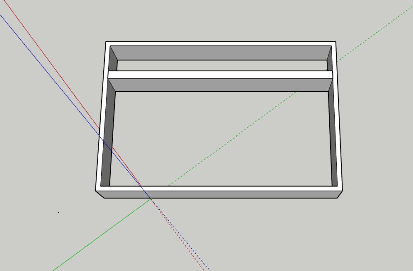
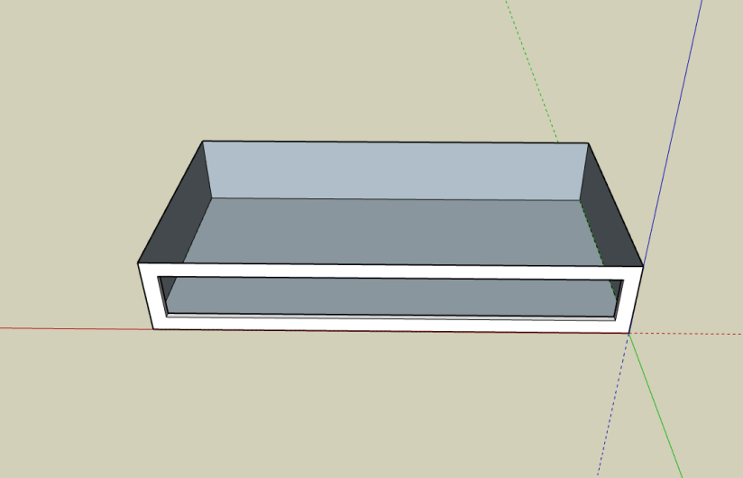
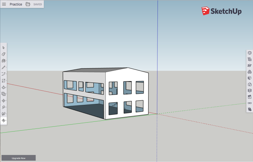
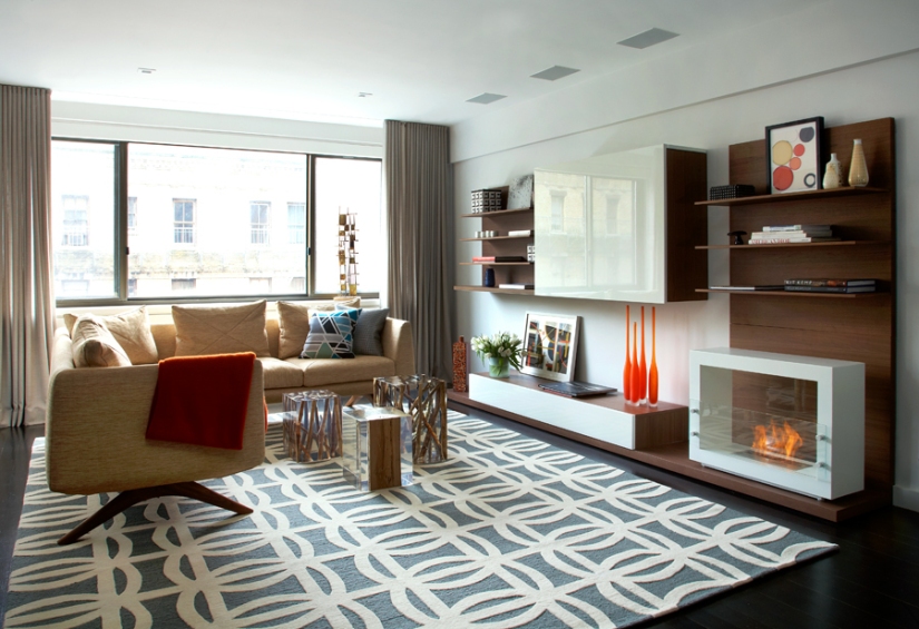
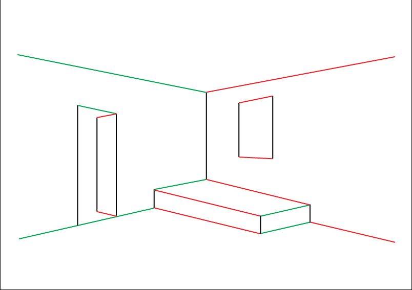
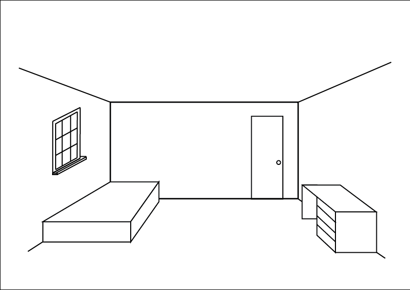
I took screenshots from a range of different perspectives to help me decided on how I want my final designs to be displayed together.
Screen Shot 2019-05-15 at 11.49.40.png

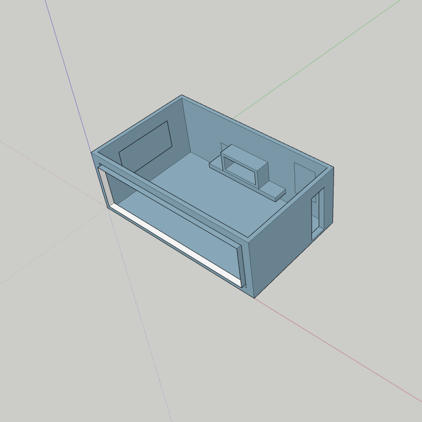
I don’t like this angle because you cannot see the edge of the sofa or the coffee table. I want to be able to see the whole sofa as this is the main furniture in my design.

Screen Shot 2019-05-15 at 11.55.39.png

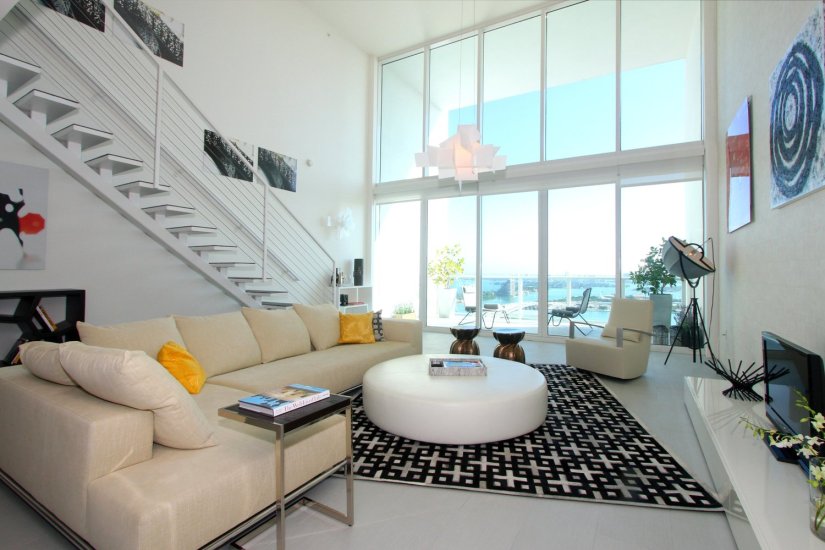
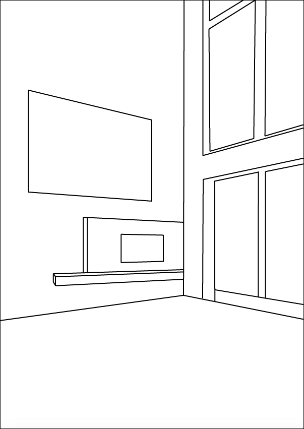
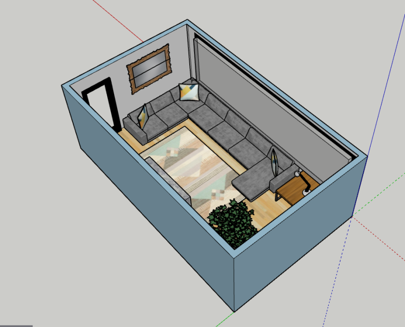
I will also be having this perspective as part of my final piece but I will be getting it printed on A2. I like this perspective because I am able to see the detail in the fireplace with the logs and fire, which I couldn’t see in the bird’s eye view plan. This perspective is the closest to a two-point perspective, which I was trying to convey through my perspective drawings.

Screen Shot 2019-05-15 at 11.57.21.png

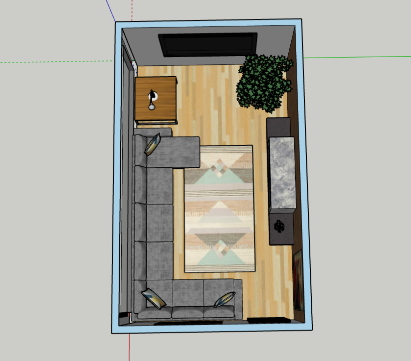
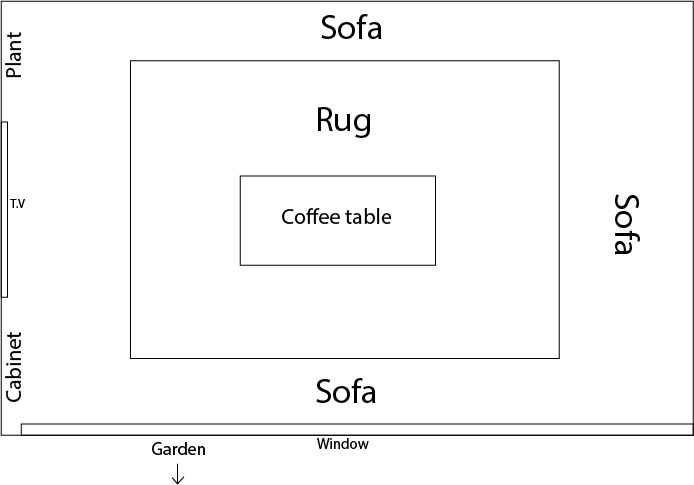
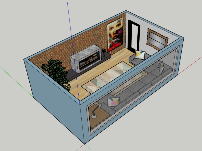
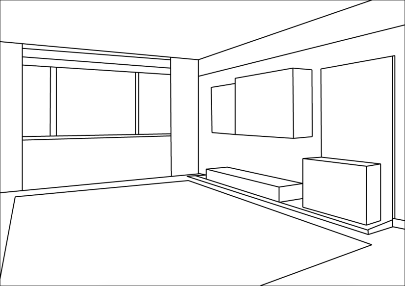
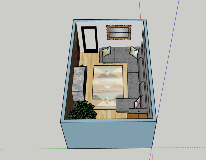
This is one of my chosen perspectives because this is a floor plan and this will help to show all the elements that I decided to include. When I get this printed it will be A1 so I can show the detail in the patterns and textures. When I come to finalising my prints I will ensure that the room is central and aligned to make it look more professional and appealing.

Screen Shot 2019-05-15 at 11.59.23.png

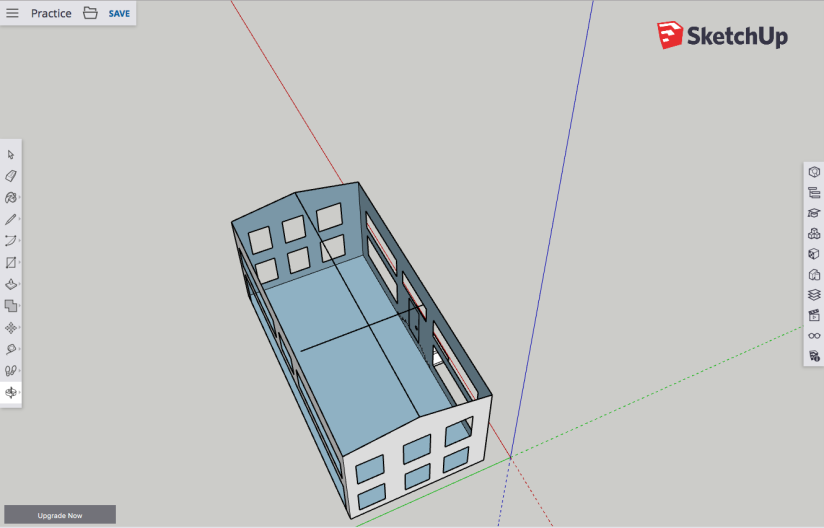
I think this angle looks messy because I can clearly see that the inside window isn’t flush with the wall, unlike the outside. This is due to myself finding it difficult to install the window, however, this isn’t an issue because I would prefer to see the whole room.

Screen Shot 2019-05-15 at 12.02.40.png

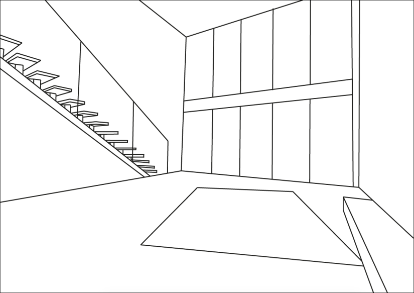
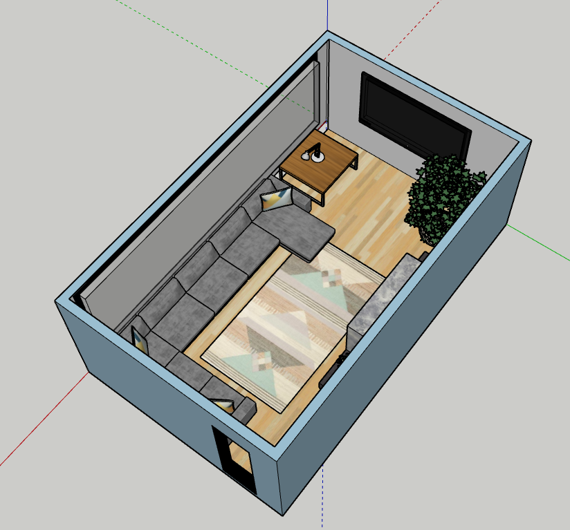
If you are looking at the plan from inside the living room towards the outside, then it is hard to identify the window because it can easily be confused with a cinema style flat screen style or potentially a feature wall.

Screen Shot 2019-05-15 at 12.04.34.png

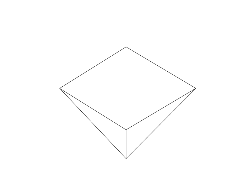
Even though you can see the sofa clearly you aren’t easily able to identify the fireplace or the vase of flowers, therefore I won’t be using it as a final design.

Screen Shot 2019-05-15 at 14.28.38.png

This perspective will be the third and final piece and I will also be getting this printed in A2. This is the flipped perspective of the other A2 so the viewer is able to see the other half of the living room. I decided to have the window facing the front so you can see how it looks in comparison to the other wall.

Unit 13 experimentations

Experiments

floor plan.jpg

I started by creating a rough floor plan on Illustrator to show where I initially was planning on putting the furniture. From the start, I was certain about having a corner sofa. Through further research I found an online design software called SketchUp, this made it easier for me to create my designs because there were more tools and facilities I needed to make my work look professional. There was also a range of YouTube videos available to help familiarise myself with the program to aid my design process.

Screen Shot 2019-05-15 at 11.47.15.png

This was my first attempt where I didn’t even create the shape on the axis, this consequently made it more difficult to rotate the building and evaluate what I needed to improve on. I didn’t use all the tools to my advantage and I mainly used the pen tool and the shape tool. As a result of this, I didn’t create a floor but I did create another wall, which was unnecessary because I am only creating I room. I also didn’t take into account how people would get in and out of the room because I didn’t include a door frame.

Screen Shot 2019-05-15 at 11.52.09.png

By this point, I was slowly progressing with SketchUp, even though I already create a house for an experiment I still had a long way to go before I was happy with my work. I came across many problems throughout this project one of them being that I was struggling to create the window, which was one of the main focus points in my design. I overcame this with a series of trial and error techniques, one of them being using the offset tool to create a window panel and pulling it forward using the push/pull tool, however, I was pushing the window frame inwards which isn’t how window frames should look. This was easily fixed by using the command Z key to undo my mistakes and pull the selection forward.

2

This was the initial shell of my living room before I included my furniture and accessories. I was still unhappy with the appearance of the window frame so I did further research into window frames and I came to the realisation that on the outside of a house the window is usually flush with the outside wall so I wanted to recreate this modern style in my design. This was quite simplistic as I was more confident in SketchUp by this point, so all that I had to do was rotate the room so that I could see it from the side on. From this point, I use the push/pull tool to bring the frame back into the wall. As part of my organisation, I marked out where I would potentially add artwork. I was going to include artwork above the fireplace, but from reading an article explaining whether or not I can, I decided not to. This wasn’t only based upon how safe it would be but also because it didn’t fit well on the wall. As well as potentially being an issue because this could be a risk if the artwork is highly flammable and too close to the flame. Although if I decided to use a gas fire then this wouldn’t be an issue.

Screen Shot 2019-05-15 at 11.55.39.png

This is the end result with the added textures and accessories and I am very happy with how it looks. For the accessories I used the 3D warehouse on SketchUp to incorporate into my design because they were free and I was amazed by the range they had to offer, they were also very good quality and fit my design well. It was easy for me to add the different textures and colours to my design, all it required was me to select the area and click on the desired colour. However I did struggle with adding the furniture because once I changed the size I then had to rotate them so they fit where I wanted them to go this was hard because you have to orbit the design to get to the top of the object before you are able to rotate it, this was something that I kept forgetting to do and ended up rotating the wrong surface. Other than that I found it easy to decide on what I wanted to include in my design due to my thorough research beforehand.

Unit 13 experimentations

Mockup


20190516_171004.jpg
This is how I want my final designs to be displayed. They will be mounted to the wall on foamboard. I printed these on A3 and A4 to get a fill of how they will look on the wall.

20190516_170945.jpg
I will have them in the centre of the wall instead of off to the side. They will look different once they are printed A1 and A2. This has given me a rough idea of how my designs will look in the end. I am not certain where my artwork will go but I chose this wall purely just to see how my work might look. I ideally would like my work alongside someones who followed a similar theme, if not then I’m not fussed where my work goes.

Unit 13 experimentations

Printing

I have decided that I will get my artwork printed in A1 and I will have my designs printed and mounted on foam board. I will also create my mood board on foam board so that I can mount it on the wall if I wish to, this will also mean that they will both be the same thickness.

I have decided on printing 3 images for my final designs, I will have 1 A1 portrait and the 2 A2’s landscape. I decided on these sizes and orientations by wanting my work to fit together on the wall easily. I want to have the A1 as my focus piece with the A2’s on the right-hand side.

I was going to get my work printed online but I decided against that and got my work printed from the college. I chose the college because it was more convenient for me and my prints were quite cheap compared to other printing facilities. I was able to send my work to be printed and collect my prints within 2 hours and I am more than happy with how they look.

Unit 13 experimentations

Using Sketchup

Screen Shot 2019-04-04 at 13.39.08.png

I was familiarising myself with using SketchUp by watching a YouTube video so that I could get used to the basic tools that I need to use, so I created an architectural design of a house. From using the tutorial I now feel confident enough to use this software for my final designs. This was due to the tutorial being detailed and thorough as well as me keep replaying certain parts of the video.

Screen Shot 2019-04-04 at 13.39.58.png

From using SketchUp I am now aware that the right hand panel allows me to use furniture and other extras to create my design in an easier way. If I had to include my own accessories I would use a free design package from Pinterest which could be time consuming.

Screen Shot 2019-04-04 at 13.40.32.png

My main goal for this project is to include a large quantity of windows so that there is as much natural light as possible. I am not likely to create the window like this as this is more like sliding doors to a conservatory, instead I will make them a little smaller. Although I want a lot of natural light entering the living room, I also want there to be comfort and security because of this I will include black out curtains as this adds to the privacy of the home.

Screen Shot 2019-04-04 at 13.41.19.png

I enjoy using the pen and the shape tool as this helps me to draw the windows so tat they are the same size and same width apart. I like this design software because it seems fairly easily to grasp and find it useful that they already have the x, y and z axis on compared to using Adobe Illustrator where I would have to draw them on. what I found difficult was using the tools to zoom in and out this is because I am used to using Illustrator where the command is straight forward. I overcame this issue when I watched  the YouTube video because they explained how to zoom in and out. It also helped to follow the tutorial which was provided by SketchUp as they explain what all the tools do.

Screen Shot 2019-04-04 at 13.42.46.png

This is my chosen perspective for how I want my final design to look. I will also see how a direct birds eye view as a floor plan will look alongside the chosen angle. For my final blog posts I will take screenshots of my designs but when I print my work off I will save my work as JPG files.

Unit 13 experimentations

Line drawings

I drew over the main features of each image in order to deconstruct them. This allowed me to look at the foundations of the rooms, this is to help me decide on my prefered style of the room. I decided to deconstruct these images because I find it easier to see the different elements of the rooms in black and white instead of bright colours and patterns.

1040_biscayne_blvd_unit_3203_MLS_HID698968_ROOMlivingroom.jpg

Screen Shot 2019-03-29 at 15.51.09.png

I like the appearance of the open space floor plans, therefore, I like the staircase. I like how modern and clean the house looks, I would like to include: stairs, large windows and a rug.

NOHA 0023.jpg

Screen Shot 2019-03-29 at 15.52.14.png

In order to make my designs modern, I will use inspiration from this style to include a floating fireplace or T.V so that I am including one focus point in the room. I want to make them risen off the floor because this creates the illusion that the room is bigger than it is, this also helps to push the idea of minimalist designs.

FOLLOWILL4166 copy.jpg

Screen Shot 2019-03-29 at 15.53.29.png

I like the position of the fireplace but I would prefer it if it was at the centre of the wall parallel to the artwork. When I create my designs I will include a large window similar to this however I will have a smaller width on the horizontal window frame, I will make it the same width as the vertical frames.

1950s Living Room

Screen Shot 2019-03-29 at 15.56.02.png

I like the irregular style of the fireplace but I would prefer it if it was hidden in the wall. This has inspired me to experiment with different shapes and textures that I am not familiar with.

In the living room, a vintage Paul McCobb sofa, a Gio Ponti side table, and an Eames lounge echo the home’s midcentury architecture—as does the thrifted red Florence Knoll Parallel Bar sofa that lends the room a shot of color.

Screen Shot 2019-03-29 at 15.57.45.png

From the line drawing, I can see that I don’t like the windows. I think that there are too many windows as I would prefer a few large windows. I would also prefer it of they were the same size throughout the living room. Due to the perspective of the room I feel that the windows are condensed. Therefore this may make it difficult to follow for inspiration for my perspective drawing.

A family retreat near Jackson, Wyoming, responds to the elements with a combination of contemporary aesthetics and traditional Western materials. | mountain modern home design and architecture, contemporary mountain home, living room, fireplace, rug, furnishings, midcentury modern furniture

Screen Shot 2019-04-01 at 16.12.11.png

I like how prominent the interior design feature line is in this space. This makes the design look futuristic and minimalistic. I like the shelves and how clean and thin they are. This shows that they are made out a strong material, which could possibly be glass due to the reflection. I am certain that I would like to include floating shelves to maximise the space that I have.

Unit 13 experimentations

3 point perspective

Screen Shot 2019-03-28 at 15.28.44.png

I drew the horizontal and vertical lines to help me decide on where to put the vanishing points.

Screen Shot 2019-03-28 at 15.40.51.png

I drew in 3 point perspective and by using Illustrator I now prefer using Illustrator because I found it easier. This is because of the software helping me get the lines the same length and the same distance apart. Therefore when I am next sketching out ideas then I will use Illustrator.

Screen Shot 2019-03-28 at 15.43.29.png

I am least likely to use this perspective towards my designs because it is mostly associated with architecture, instead I am more likely to use 2 point perspective. Also because I prefer the appearance of the work produced in 2 point perspective.


Unit 13 experimentations

2 point perspective

Screen Shot 2019-03-27 at 12.37.19.png

I am most likely to use this perspective because I am able to use an angle to best show my designs next to one another.

Screen Shot 2019-03-27 at 12.38.22.png

The horizontal grey line represents eye level this makes it easy for me to make sure that the lines are the same length and distance apart. The black vertical line is to show the furthest corner of the room, the green and red lines are the vanishing points.

Screen Shot 2019-03-27 at 12.40.23.png

I have drawn the lines in green and red to show the different angles, also because I was following an article on how to draw in perspective and they followed the same principle.

Screen Shot 2019-03-27 at 12.47.43.png

I drew the basic interior of a bedroom even though I am planning on create a living room. This was purely to practice drawing the furniture to make it proportional to one another.

Screen Shot 2019-03-27 at 12.55.10.png


Although I am familiar with using Illustrator I took this opportunity to decide on the main tools which I will be using towards my designs. This has allowed me to find out the tools I prefer to use as this will save time, this is because I can use certain tools as short cuts. This is also personal preference. I now know that I enjoy using the line tool as apposed to the pen tool. Therefore I feel more confident about creating my designs.

Screen Shot 2019-03-27 at 13.21.38.png

I enjoy drawing from this angle because I can compare the different walls and see how the work flows together. This will allow me to see what the outcome may be if I have a different colour on one of the walls or if I decide to use wallpaper, as a feature wall, then  it is essential that the don’t clash together.

Screen Shot 2019-04-23 at 16.08.24.png
For my final pieces I will include a large window but for the purpose of this perspective I used a small window. Now that I’ve drawn the window I am certain that I would prefer a large window, even though this will take up a large amount of space where I could be adding artwork and other design features, this will allow the room to be light up by natural lighting. Another thing that I have decided is that I won’t have the window this close to the ceiling as I will have the window the same height as the door.

Unit 13 experimentations

1 point perspective

Screen Shot 2019-03-27 at 10.45.07.png

This is called 1 point perspective because you are only drawing from one given point. Even though all three show you how to draw in 3D they are from different points of the same room.

Screen Shot 2019-03-27 at 10.46.14.png

I started off by drawing a rectangle in the centre of the page and adding the blue horizontal line approximately 2/3 of the way up.

Screen Shot 2019-03-27 at 10.47.20.png

I enjoyed drawing in this perspective because this allowed me to use the line as a guide to make sure that my furniture was in proportion to the size of the room, therefore I can get it as close to how I want it to look without needing to include measurements because it should be clear enough just from its appearance.

Screen Shot 2019-03-27 at 11.06.44.png

I think I made the door too large compared to the height of the ceiling. This is a learning curve for me as I will be more aware of the sizes next time. This will help me create a more accurate design to help convey how I want my designs to look.

Screen Shot 2019-03-27 at 11.07.59.png

I drew the accessories using the line tool however this was quite time consuming and I would prefer to use a interior design pack which includes the furniture in a range of styles to choose from. I will be able to decide on a specific design pack by doing further research into the range they have on Pinterest, which are free to download.

Unit 13 experimentations

Drawing in perpective


Screen Shot 2019-03-11 at 15.35.03

I started my experimentations by familiarising myself with drawing in perspective using Illustrator. By practicing with point perspectives then this will aid my designs by being able to visual what angle I want my final designs to be.

Screen Shot 2019-03-11 at 15.57.46

I used the points to help me align the shape and keep everything square and proportionate.

Screen Shot 2019-03-11 at 16.08.20

The windows are aligned with the focus point to show the direction that the building is facing.


house

Through this I have decided that I prefer using the line tool to the pen tool. Also my familiarity with Illustrator will make it easier for me to create my final designs because I won’t have to wait time getting used to new software.

house

This is the end result and I am happy with it because I now feel more confident about how to approach different shapes from different angles. This will further help me with my design process.