Graphic Design
Contemporary living room
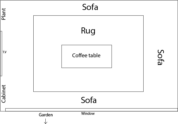
My project conveys the importance of space within a home and how I can bring the most light into the living room. I created my ideal living room following a contemporary art design style. In order to portray this, I used the software SketchUp, which is commonly used by professionals. A focus point throughout my work was to revolve my living room as being a family orientated, comfortable environment and this can be seen with the large T.V and sofa.
Progression: BA(Hons) Interior Design- Southampton Solent University
My theme this year was Interior design of a living space where I decided to create my ideal living room using the latest design software, SketchUp. I chose this theme as I have a passion for this subject, I want to progress to Solent University to study Interior design. I felt that if I was to create an interior based project for my FMP, then this will provide me with the skills needed for September, and I should be at an advantage compared to the rest of the students.
At the start of the project, I wasn’t sure what my overall design style would be. However from researching into the interior designers: Phillipe Starck, Noha Hassan and Benjamin Vandiver. I used these three men for inspiration towards my design process because they mainly work in domestic environments as opposed to commercial. All three interior designers have their own individual style which mainly consists of modern living rooms and using the limited spaces available, however, I was able to design how I want the room to look starting with the dimensions of the living room and even down to the thickness of the walls, therefore this made me certain that I wanted to create a modern living room. I also researched into different styled living rooms throughout the ’50s and 60’s to see how they differ and also because I am intrigued in vintage style and wanted to incorporate some of these properties in my final designs. I think that it is harder to design a space where you are somewhat constricted with your creativity. This because if you are working with a client then you have to design something that they are happy with, also because you will have to take into account any health and safety measures, especially if you are working in the commercial design industry.
As part of my primary research, I took it upon myself to email the interior design course leader, Sarah Bax, of Southampton Solent University a few questions to aid my design process. I found that she was able to give me inspiration towards my design process by saying that she is inspired by the architect Louis Kahn, who incorporates daylight in his designs. This is evident in my final designs by including the large window to allow more sunlight into the living room throughout the day. I also further portrayed this by adding the direction of sunlight, with the shadows on my final pieces so that the viewer can see the importance of the window, especially as I made my room north facing to allow more hours of direct sunlight. Consequently, this will be reducing the amount of electricity needed to light up the space, therefore it will be more energy efficient and environmentally friendly. Although energy saving wasn’t one of my main objectives throughout this process, I am glad I included it because I value the environment and will do my bit as an aspiring interior designer to help reduce the risks of global warming.
I initially planned to have my living room designs along with my lino print, which I was going to use to create my own pattern print on fabric, from this I then intended to create my own range of scatter cushions and artwork for my ideal living room. However I quickly realised that I bit off more than I could chew against the timeframe I had, even though this project was 16 weeks long, which is twice as long compared to last year, I would need far more time. Instead, I re-evaluate my goals throughout this project and decided to focus on perfecting my visual representation of my living room. I wanted to create a contemporary living room which incorporates specific elements that link to vintage design within homes. I was able to do this by using my time wisely by including a large amount of detail in my designs, this also allowed me to familiarise myself with SketchUp by practising and watching YouTube videos. My main meaning behind my theme was to create a safe and comfortable environment for the whole family. Family means everything to me, so in my ideal living room, I wanted to include enough furniture and space for all my loved ones. I feel that I was successful at that by including the large corner sofa. Also in this modern day and age the T.V is a vital piece of technology in every home and in this instance I think that playing games or watching movies together can bring a family closer together, that is why I included the cosmic-sized T.V. I also wanted to make the living room cosy so I decided on the colour temperature 2860 k as this is close to the same colour temperature of a candle, which is 3000 k, this warm lighting allowed me to create a comforting environment in the form of a living room. At the start of the project I was adamant that I would be using Adobe Illustrator to create my designs, however, I researched into interior design pages on Instagram and found that a lot of professionals in the industry use the software SketchUp, this is when I created an account and started using it online. I now prefer using SketchUp to Illustrator because the software is more advanced and specific to my field of interest.
The materials I mainly relied on throughout this project was Illustrator and Sketchup, as well as YouTube videos to help me familiarise myself with the new software I decided to use. I used a range of textures as part of my mood board to create depth within my design process, and also make my designs interactive by allowing the audience to touch the textures as this will further help to portray my designs. As mentioned in my blog post ” Mood board”, I used three different types of wood, colour samples, wallpapers and fabrics. I think that the materials I used worked to convey my message because the samples were fairly similar to the patterns in my designs, even though I wanted to match them perfectly, there are some limitations to the 3D warehouse. Therefore if I was to create this project again, I would make all of the elements from scratch, instead of relying on the 3D warehouse.
If I was to do this project again I would broaden my horizon by researching into architectures as well as interior designers and possibly into interior architectures as well. This is so that I can get inspiration from a range of different areas of design. This will also allow me to compare the differences between each style to help influence my development work and therefore my final designs. Another change I would make is challenging myself to set a budget on the amount that I am allowed to spend on the interior of the living room. I believe that this will be a challenging task but it will also provide me with the key skills needed throughout the course of my degree, as well as in the working industry. Since I am passionate about reducing our carbon footprint in order to save our planet, I could set myself the task to create an entire house that only relies on renewable energy sources, such as solar cells and the collection of water to be used in the plumbing throughout the house. I would like interior architecture/ architectures to be influenced by my design and aim to create a better place to live without harming the environment. I would be honoured if I had the opportunity to work on such an amazing project alongside the best designers in the world.
Throughout my work, the main elements I referenced and used were light and colour, as well as pattern, I used these to create the warm, comforting atmosphere I desired. Colour played the main role in my work because I was trying to make the living room as appealing as I could, so I used a colour scheme that I am familiar with. Overall I decided on a neutral colour scheme to help reflect the sunlight throughout the day but from using blackout curtains this soon makes the space warm and inviting. I mostly considered patterns in the accessories like the cushions and the rug because they weren’t re-occurring, which is new for me but I branched out in my designs and am happy with the progress I have made.
My planning and organisation skills were considerably better than my last project, this is because I took the time to create a weekly timetable that stated what I would be doing and the resources I would need so that I could prepare in plenty of time. As my project progressed I was regularly looking back at my timetable so I could stay on task and use my time wisely. I was also constantly giving myself checklists in my notebook to focus my attention on the work that I had to complete. From the start of my project, I mentioned that I would be collecting my primary research during the easter half term by going to places like B&Q and Ikea. As part of my organisation skills, I did go through with the initial plan and consequently, I was able to use the samples I collected to help me decide on the interior of my living room. If I didn’t go when I said I was going to then this could have made my life harder because I wouldn’t have been able to get a feel of the textured samples, as opposed to being able to see them on the computer screen. This means that my planning and organisation skills have enabled me to succeed in my work.
Through this project, I have gained strengths, particularly in my independence. This is because for this project you are forced to be independent right from the start as you have to create your own theme for your work. As a result of this, this has made me more self- sufficient, although I did regularly ask for feedback from my peers so they could tell me my areas of improvement. Another strength of mine is my design skills because I was able to learn the mechanics of new software without much help at all. I was also able to quickly familiarise myself with the tools needed to successfully create my final pieces, so I wasn’t wasting time, therefore this gave me more time to spend on filling the interior space with the most flattering accessories. One of my weaknesses was staying focused because I am easily distracted, this resulted in me falling behind with my work, consequently, this made me more stressed to meet the deadline with my work at a distinction level. In order to improve upon this, I can move away from the distraction and continue to listen to my music, which helps me concentrate. Another weakness of mine was my time management, this goes hand in hand with being easily distracted, sometimes I didn’t use my time wisely because I would take longer on a task than I should have. As a result of this, I wasn’t allowing myself enough time on the tasks that should take longer. In order to improve on this, I will give myself a time frame. An example of this would be creating sketches to initiate and show my ideas, I would give myself the time frame of a couple of hours at most instead of a whole day. This will help to focus me better and complete my work with less stress of meeting the deadline.
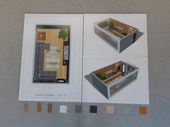
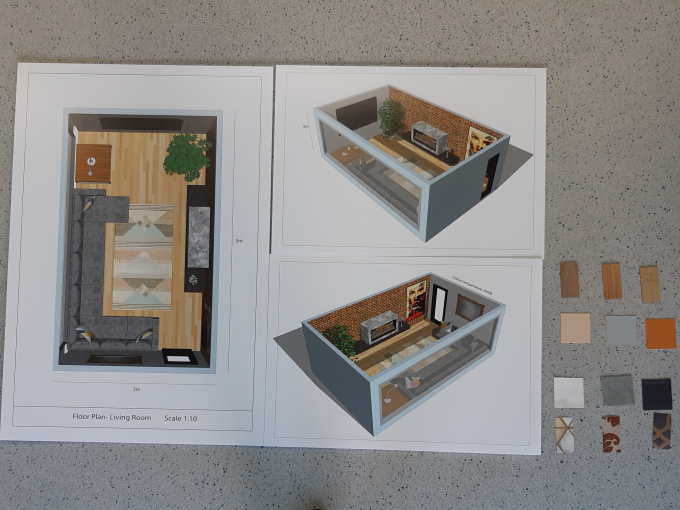
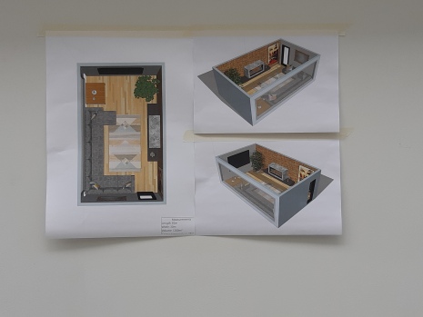
My opinion on my development work is that it clearly shows the evolution of my ideas and my thought process. I am happy with the amount of progress I have made through this project because I was able to use a software that I am unfamiliar with and show how I was able to do this with the reflection on what was successful and what wasn’t. I also explored more techniques like line drawings which enabled me to see how designs looked when they are stripped back to the foundations of the house. For me, this made it easier for me to deconstruct the images and gather inspiration from such detail like the panels between the window frames and if there is a large amount of floor space to use. Even though my developmental work was good overall, I could have elaborated more on what went well and what didn’t. My opinion on my final designs is that overall I was successful at portraying the image I set out to. I feel that a large majority of my work was self-sufficient even though I did require help for the typography aspects. I am very happy with the overall appearance of my final designs because I stepped out my comfort zone and pushed my designs further until I was happy with them. My favourite part of my designs was the bird’s eye view of the plan because you are able to see the whole plan and see how the sizes of the furniture compare against one another. This is why I had the bird’s eye view perspective printed on A1 and my other perspectives print on A2.
Overall, I am happy with the progress I have made throughout this project and I will be able to share my valuable knowledge at University as this will provide me with a head start in my learning, so I am able to continue to grow as an aspiring interior designer. This project has allowed me to become more independent with my work and this will further help me with the independence of University throughout my degree.
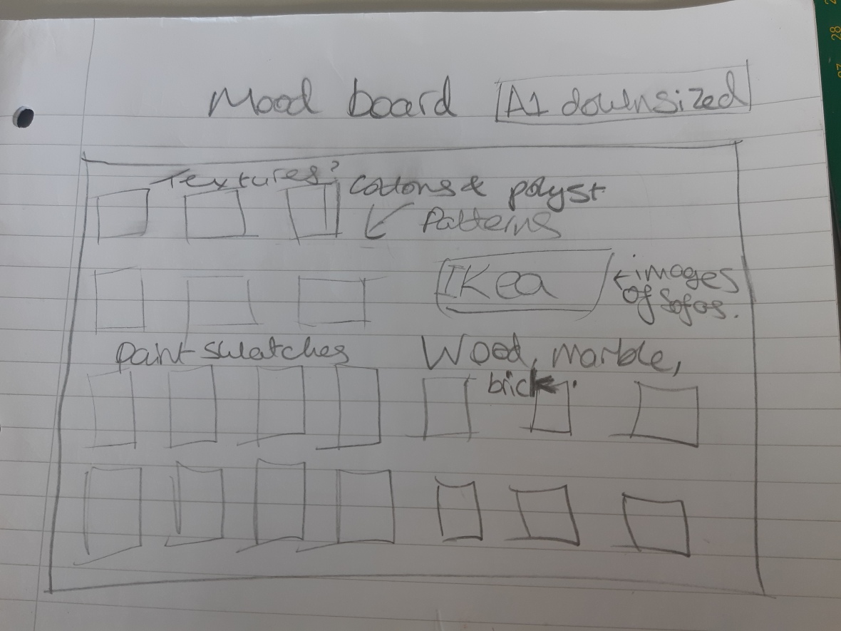
This was my initial mood board idea but I soon realised that having my mood board A1 it would be unnecessarily big. So I decided to get rid of the Ikea cards with the sofas on, as well as the marble and brick texture.
I will be having the mood board at the bottom of the designs. I will be using a hot glue gun to fix the textures to the foam board, but I am only glueing the tops of the fabric samples so that people are able to touch them easily.
I wasn’t going to include the wallpaper because I didn’t use wallpaper in my final design but I did get quite a lot of inspiration from the patterns and colour schemes. This way there will be an even number of textures. In my opinion, this will make it look more appealing because there will be two rectangular patterns and two square patterns.
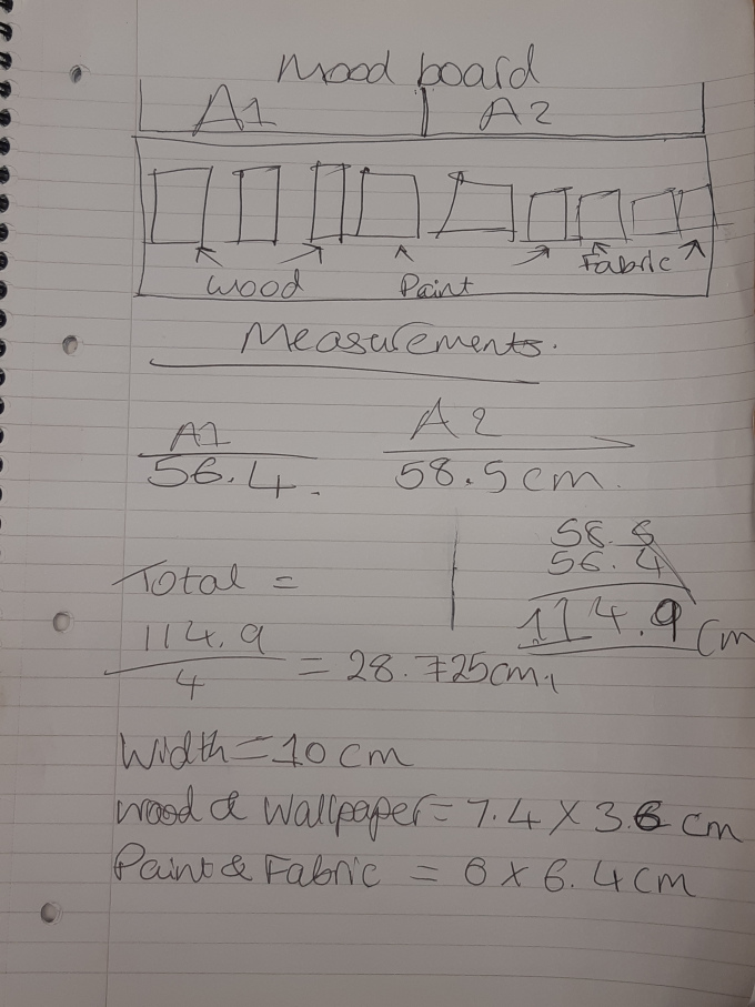
This is how my mood board will be displayed at the end. I worked out the length of A1 and the A2 and divided it by four because that is how many separate pieces of foam board there will be. Above are my measurements and I will be having each piece of foam board 28.725 x 10cm.
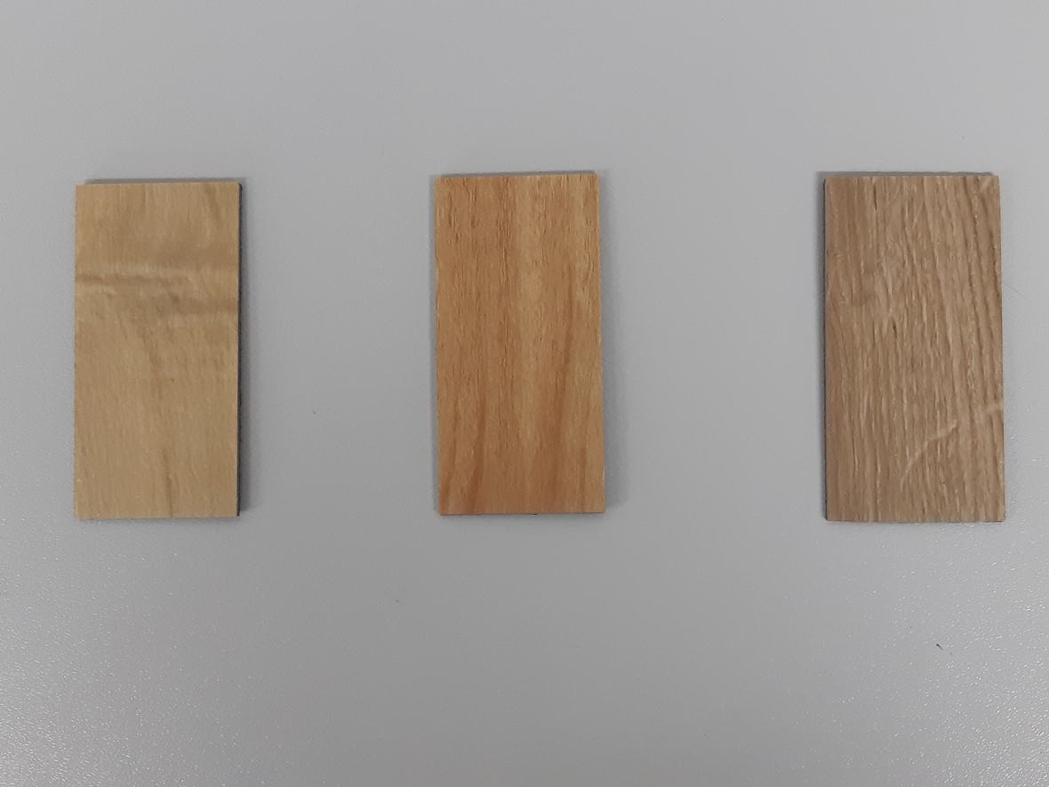
The wood samples are Polyflor Camaro tiles in the colour Ambrosia Maple, Nut Tree and Natural Oak. I was able to get these from a pattern book that my dad owns, as he is a floor layer.
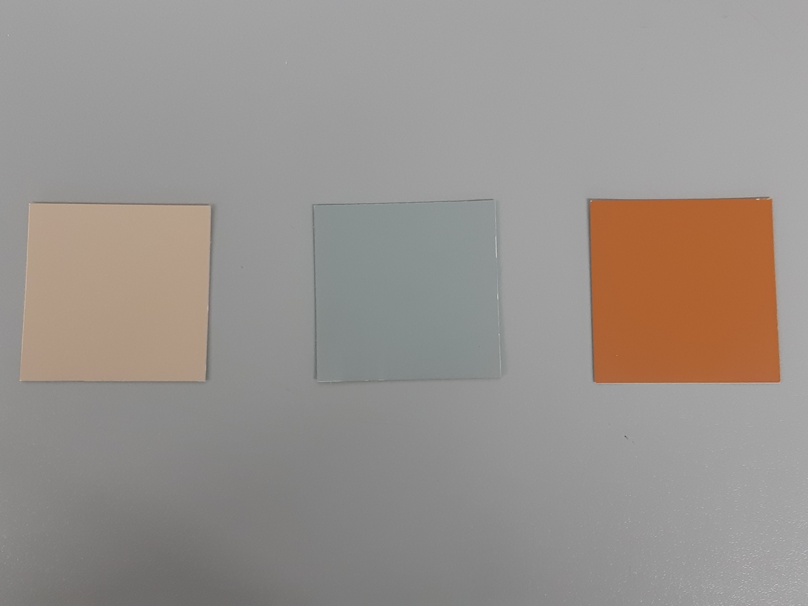
I collected these samples from B&Q and most of them were from the pastel collection by Valspar but the orange was from Dulux.
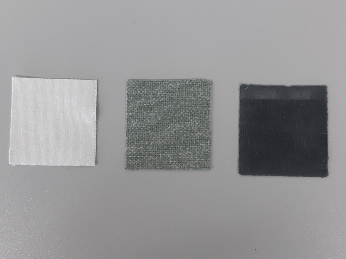
These fabric samples are from Ikea where I had access to many free samples in their Creative Hub.
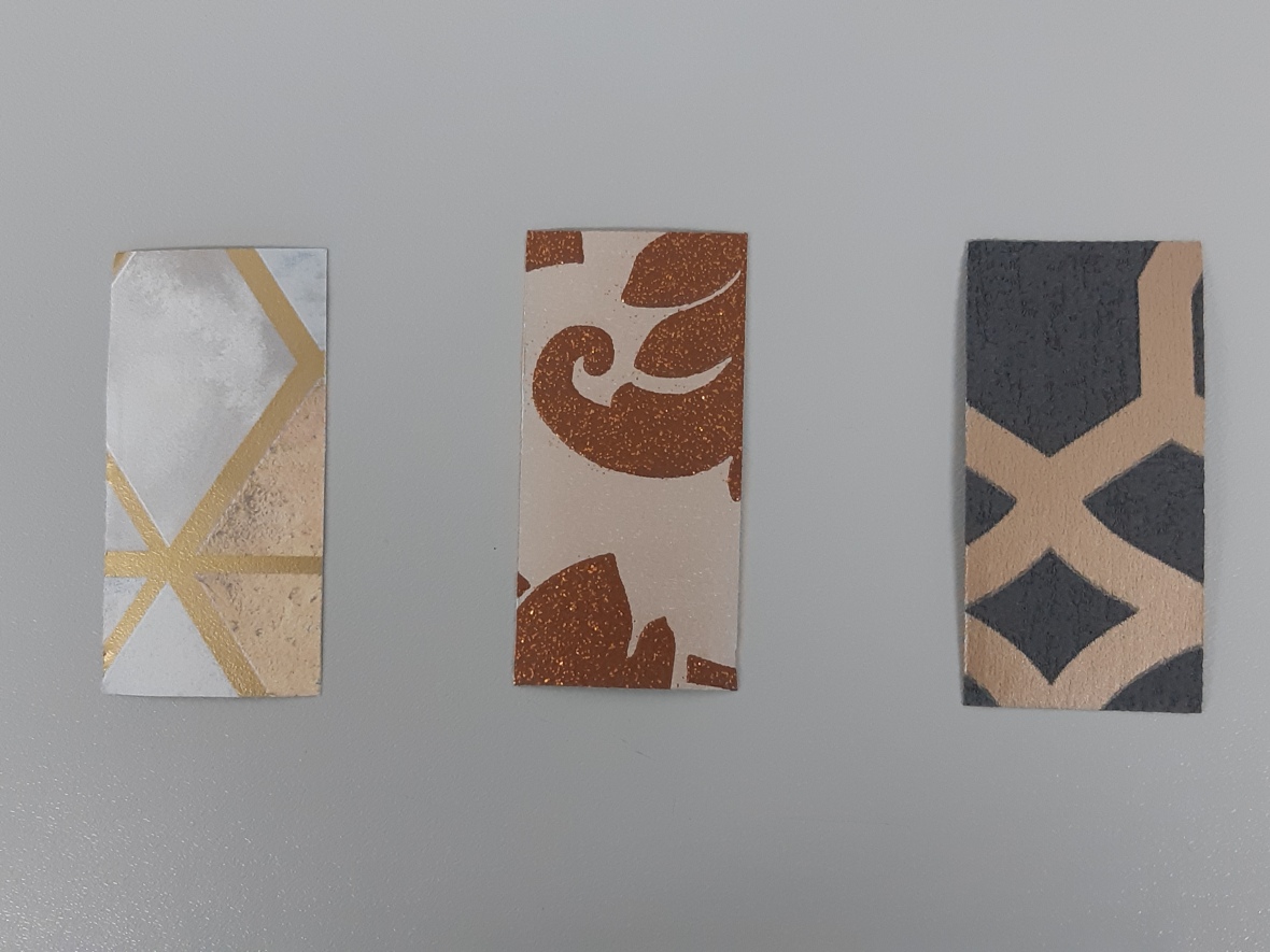
Although I didn’t include wallpaper I do feel that my work was heavily influenced by the composition of the first sample. The name of the wallpapers are Mineral Geo, Kingsley and Marrakech.
Launchpad Academy. (2019). 7 Elements of Interior Design – Launchpad Academy. [online] Available at: http://launchpadacademy.in/elements-of-interior-design-2/ [Accessed 25 Mar. 2019].
utorials, V. and Tools, M. (2019). One Point Perspective Drawing: Step by Step Guide for Beginners. [online] HelloArtsy. Available at: http://helloartsy.com/one-point-perspective/ [Accessed 26 Mar. 2019].
Pacheco, C. and Morfis, J. (2019). 2 Point Perspective Drawing: Step by Step Guide for Beginners – HelloArtsy. [online] HelloArtsy. Available at: http://helloartsy.com/2pt-perspective/ [Accessed 27 Mar. 2019].
KERALA, N. and Morfis, J. (2019). Linear Perspective Drawing: overview of 3 drawing types. [online] HelloArtsy. Available at: http://helloartsy.com/linear-perspective-drawing/ [Accessed 27 Mar. 2019].
YouTube. (2019). How to Draw 3 Point Perspective for Beginners. [online] Available at: https://www.youtube.com/watch?v=rjblc49F6lI [Accessed 28 Mar. 2019].
BENJAMIN VANDIVER INTERIORS + LIFESTYLE. (2019). GALLERY — BENJAMIN VANDIVER INTERIORS + LIFESTYLE. [online] Available at: https://www.benjaminvandiver.com/gallery#/gallery-no-3/ [Accessed 28 Mar. 2019].
NOHA HASSAN DESIGNS. (2018). PROJECTS. [online] Available at: http://www.nohahassandesigns.com/projects#/miami/ [Accessed 28 Mar. 2019].
NOHA HASSAN DESIGNS. (2018). PROJECTS. [online] Available at: http://www.nohahassandesigns.com/projects#/upper-east-side/ [Accessed 28 Mar. 2019].
MacDonald, K. (2019). The Dos and Don’ts of Hanging Art Above a Fireplace. [online] Houzz. Available at: https://www.houzz.co.uk/magazine/the-dos-and-donts-of-hanging-art-above-a-fireplace-stsetivw-vs~70773521?irs=US [Accessed 3 May 2019].
TheGreenAge. (2019). Colour Temperature, Colour Rendering and Lumen Efficiency – TheGreenAge. [online] Available at: https://www.thegreenage.co.uk/tech/colour-temperature-colour-rendering-lumen-efficiency/ [Accessed 16 May 2019].
Any-lamp.com. (2019). Which color temperature for what room?. [online] Available at: https://www.any-lamp.com/blog/which-color-temperature-for-what-room/ [Accessed 21 May 2019].
Once I decided on the chosen perspectives I exported all the files as PNG’s and edited them in Illustrator. I altered the page layout by ensuring that the plan was in the centre of the page, this wasn’t difficult because I was able to use the rulers to make everything equidistant. I want all three pieces to flow together nicely so I included the same sized border and made sure that the typeface was the same size and colour throughout. I used a charcoal grey as it was less harsh than jet black and it complimented my work better. The typeface I used was Myriad Pro in the size 12p, I chose this typeface because it had the right weight to it, as I didn’t want the text to be bold and heavy as this would have looked out of place with the thin lines of my designs. Myriad Pro is a sans- serif typeface and I prefer sans- serif to serif in this context because it looks more modern, if my work was primarily typography then I would coincider using a serif font.
Reflecting back to my primary research, the textures and materials I chose to use are fairly similar to the ones I intended to use. The few parts that I decided to alter were the feature wall, rug and artwork. For the feature wall, I was aware that I wanted a natural texture so I decided on a brick wall, I got the inspiration from when I researched into typical ’50s and 60’s living rooms, and there was a grey stone wall which worked well with the colour scheme and overall appearance of the living room. The rug I chose is of pastel and geometric scheme which complements the mixture of tones in the wood flooring. Even though I intended to include geometric art I still incorporated geometric designs in the rug. I originally planned to include multiple pieces of artwork, however, I found that one large piece of art looked more appealing, especially with the large plant that I included. Instead of adding more than one piece of art, I added a large mirror to fill up wall space. The mirror gives the impression that it is vintage, with the metal used and the style of the frame. I wanted the window and door frame to be black as this isn’t common in interior design because they mostly use a white gloss. If I was to use white then I think that the room would be too bright, this wouldn’t help me create a warm-toned living room.
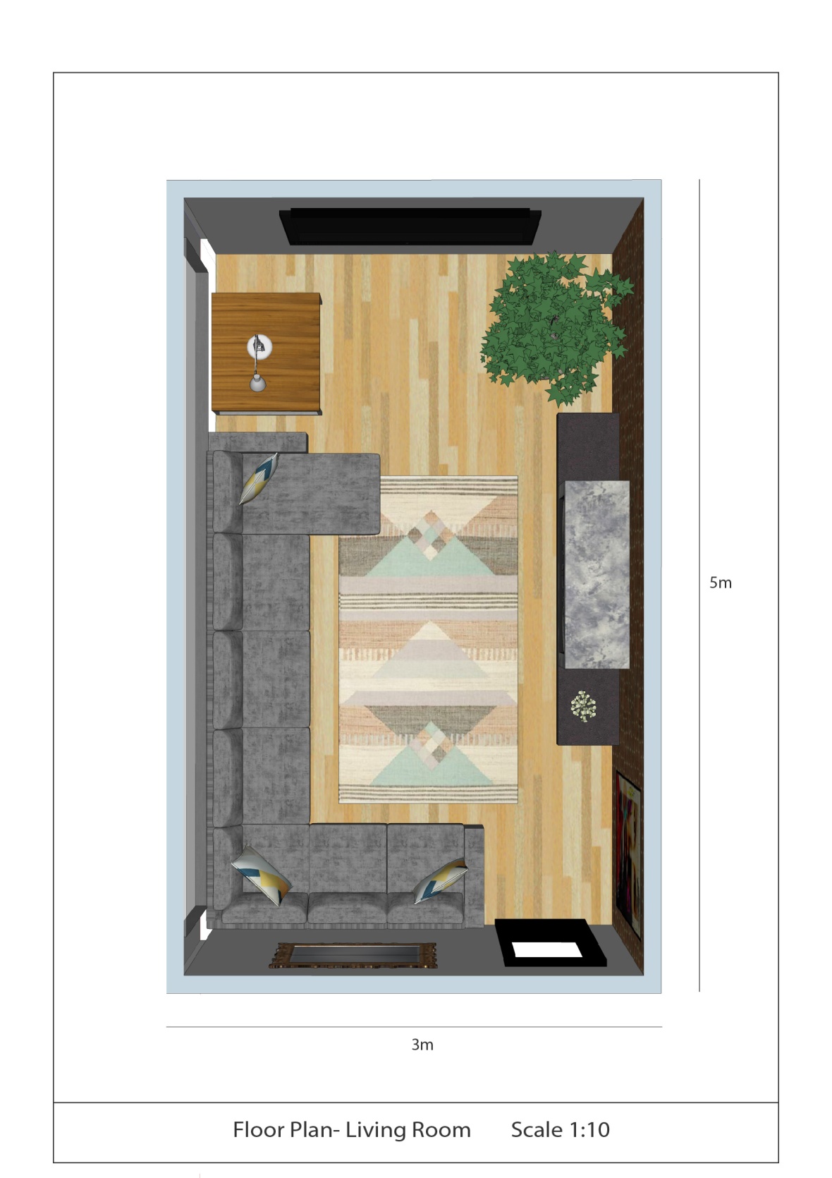
From looking at technical dimensions I decided that I was going to include a bar at the bottom of the page with more information to help explain my design better. The scale is so that the viewer can visualise how it will look in person. I also included the length and width of the dimensions to make my work seem more professional.
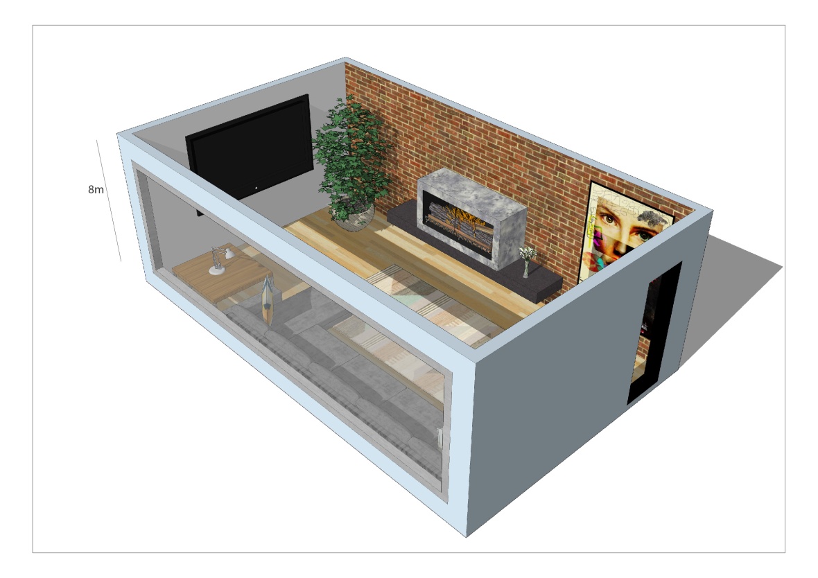
For the landscapes, I decided to add a shadow effect to create depth and to help further show the window by having the light passing through. Also by having a shadow you are able to see that the living room is north facing. I included the height of the building to make my designs seem more realistic.
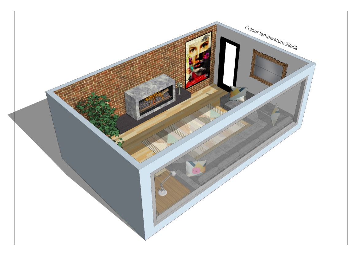
I included the colour temperature to show that I want the room to be warm-toned as I am unable to convey to colour through the daylight effect that I have added.
I took screenshots from a range of different perspectives to help me decided on how I want my final designs to be displayed together.
I don’t like this angle because you cannot see the edge of the sofa or the coffee table. I want to be able to see the whole sofa as this is the main furniture in my design.
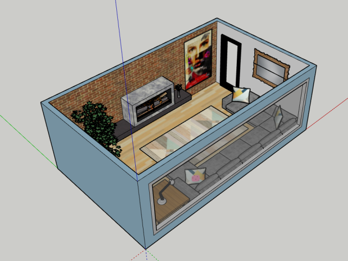
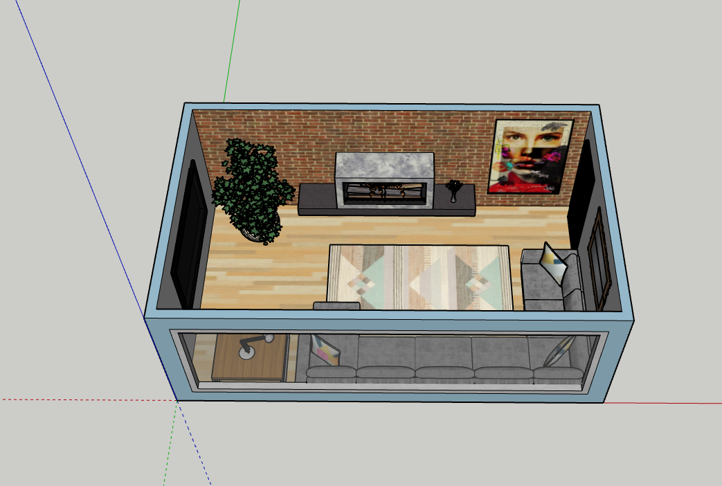
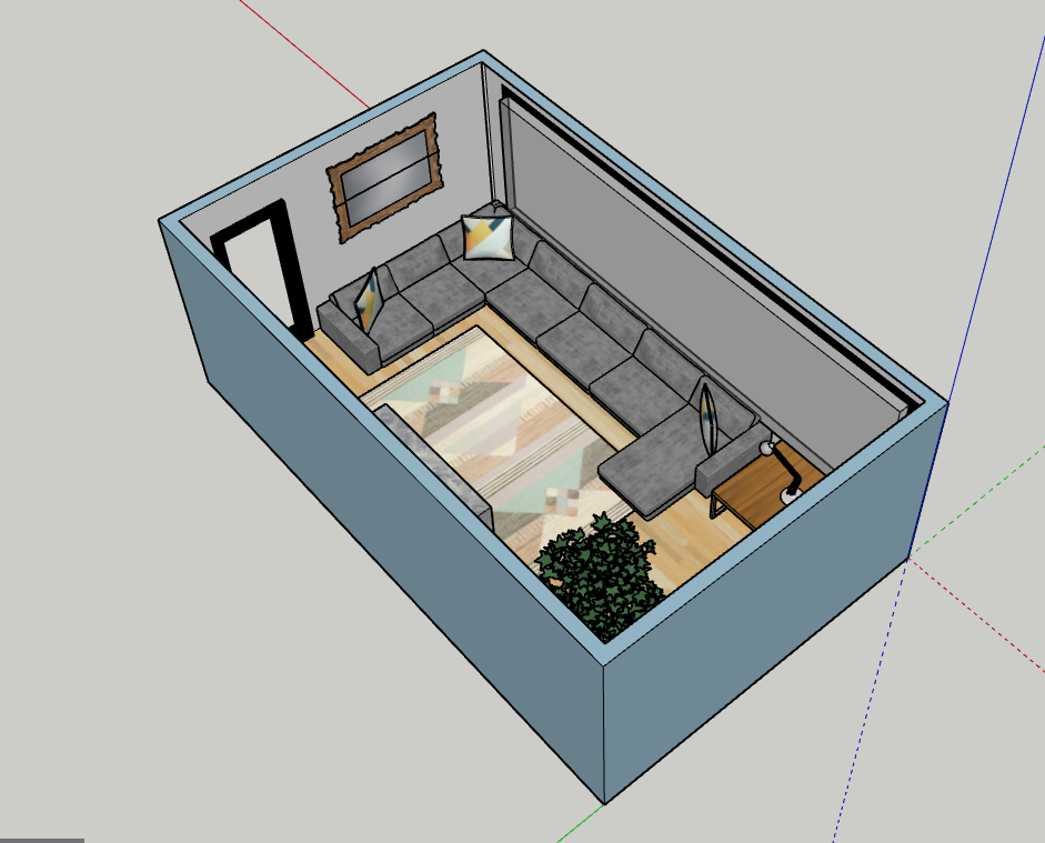
I will also be having this perspective as part of my final piece but I will be getting it printed on A2. I like this perspective because I am able to see the detail in the fireplace with the logs and fire, which I couldn’t see in the bird’s eye view plan. This perspective is the closest to a two-point perspective, which I was trying to convey through my perspective drawings.
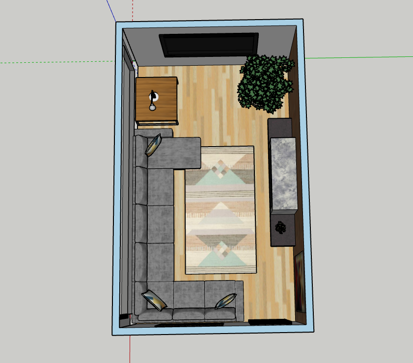
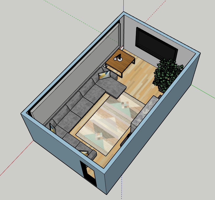
This is one of my chosen perspectives because this is a floor plan and this will help to show all the elements that I decided to include. When I get this printed it will be A1 so I can show the detail in the patterns and textures. When I come to finalising my prints I will ensure that the room is central and aligned to make it look more professional and appealing.
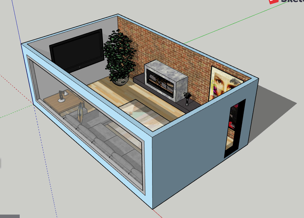
I think this angle looks messy because I can clearly see that the inside window isn’t flush with the wall, unlike the outside. This is due to myself finding it difficult to install the window, however, this isn’t an issue because I would prefer to see the whole room.
If you are looking at the plan from inside the living room towards the outside, then it is hard to identify the window because it can easily be confused with a cinema style flat screen style or potentially a feature wall.
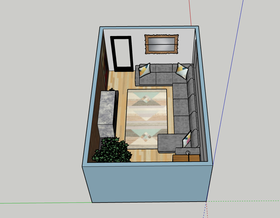
Even though you can see the sofa clearly you aren’t easily able to identify the fireplace or the vase of flowers, therefore I won’t be using it as a final design.
This perspective will be the third and final piece and I will also be getting this printed in A2. This is the flipped perspective of the other A2 so the viewer is able to see the other half of the living room. I decided to have the window facing the front so you can see how it looks in comparison to the other wall.
I started by creating a rough floor plan on Illustrator to show where I initially was planning on putting the furniture. From the start, I was certain about having a corner sofa. Through further research I found an online design software called SketchUp, this made it easier for me to create my designs because there were more tools and facilities I needed to make my work look professional. There was also a range of YouTube videos available to help familiarise myself with the program to aid my design process.
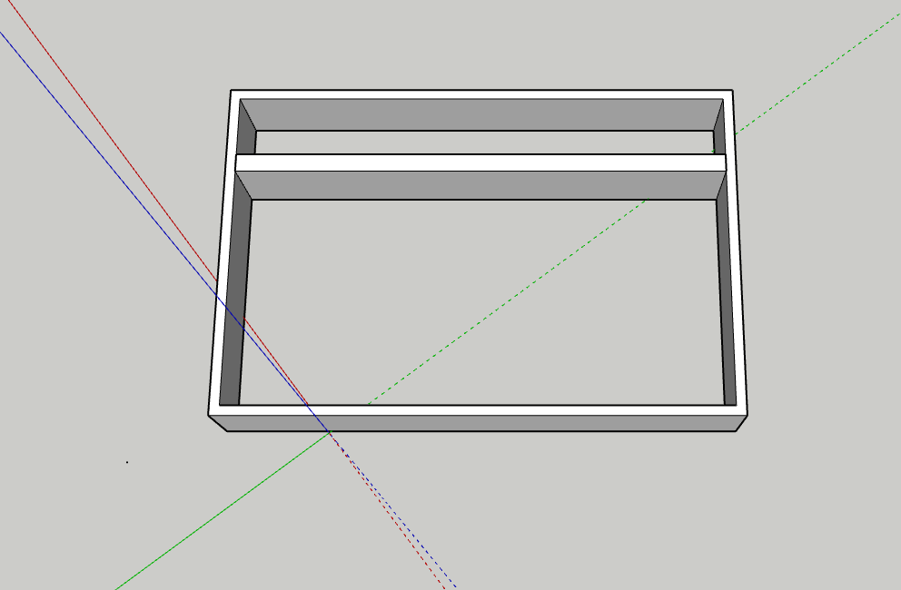
This was my first attempt where I didn’t even create the shape on the axis, this consequently made it more difficult to rotate the building and evaluate what I needed to improve on. I didn’t use all the tools to my advantage and I mainly used the pen tool and the shape tool. As a result of this, I didn’t create a floor but I did create another wall, which was unnecessary because I am only creating I room. I also didn’t take into account how people would get in and out of the room because I didn’t include a door frame.
By this point, I was slowly progressing with SketchUp, even though I already create a house for an experiment I still had a long way to go before I was happy with my work. I came across many problems throughout this project one of them being that I was struggling to create the window, which was one of the main focus points in my design. I overcame this with a series of trial and error techniques, one of them being using the offset tool to create a window panel and pulling it forward using the push/pull tool, however, I was pushing the window frame inwards which isn’t how window frames should look. This was easily fixed by using the command Z key to undo my mistakes and pull the selection forward.
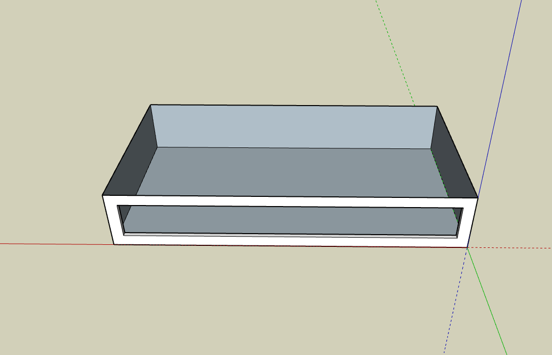
This was the initial shell of my living room before I included my furniture and accessories. I was still unhappy with the appearance of the window frame so I did further research into window frames and I came to the realisation that on the outside of a house the window is usually flush with the outside wall so I wanted to recreate this modern style in my design. This was quite simplistic as I was more confident in SketchUp by this point, so all that I had to do was rotate the room so that I could see it from the side on. From this point, I use the push/pull tool to bring the frame back into the wall. As part of my organisation, I marked out where I would potentially add artwork. I was going to include artwork above the fireplace, but from reading an article explaining whether or not I can, I decided not to. This wasn’t only based upon how safe it would be but also because it didn’t fit well on the wall. As well as potentially being an issue because this could be a risk if the artwork is highly flammable and too close to the flame. Although if I decided to use a gas fire then this wouldn’t be an issue.

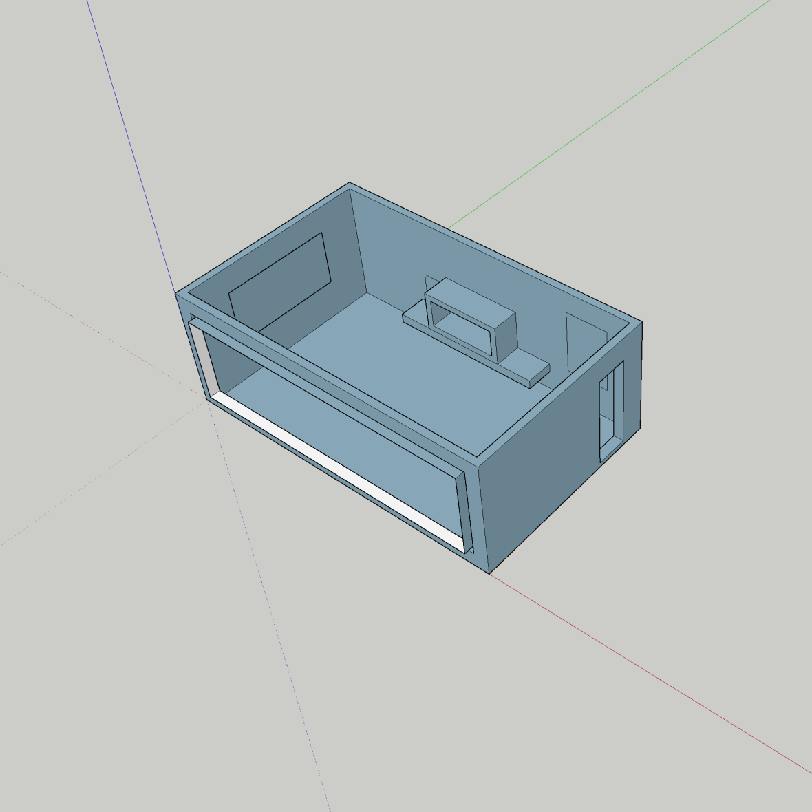
This is the end result with the added textures and accessories and I am very happy with how it looks. For the accessories I used the 3D warehouse on SketchUp to incorporate into my design because they were free and I was amazed by the range they had to offer, they were also very good quality and fit my design well. It was easy for me to add the different textures and colours to my design, all it required was me to select the area and click on the desired colour. However I did struggle with adding the furniture because once I changed the size I then had to rotate them so they fit where I wanted them to go this was hard because you have to orbit the design to get to the top of the object before you are able to rotate it, this was something that I kept forgetting to do and ended up rotating the wrong surface. Other than that I found it easy to decide on what I wanted to include in my design due to my thorough research beforehand.
I have decided on having the colour temperature at 2860 k. I chose this because I want extra warm lighting if I chose 1000 k then this is the equivalent to candlelight and this would be too dark.
“This colour temperature is pure mood lighting, which creates an atmosphere like candlelight. It can be used to create a more relaxing or romantic setting. Keep in mind that the traditional incandescent bulb has a colour temperature about 2700K.” I got this from an article on professional lighting and this has reassured me that my colour choice is the best for the atmosphere that I am trying to create because I want to portray a cosy environment. The main activities that will take place in the living room are watching T.V and lounging on the sofa with friends and family, therefore, this helps to create a warm and safe environment.
This is how I want my final designs to be displayed. They will be mounted to the wall on foamboard. I printed these on A3 and A4 to get a fill of how they will look on the wall.
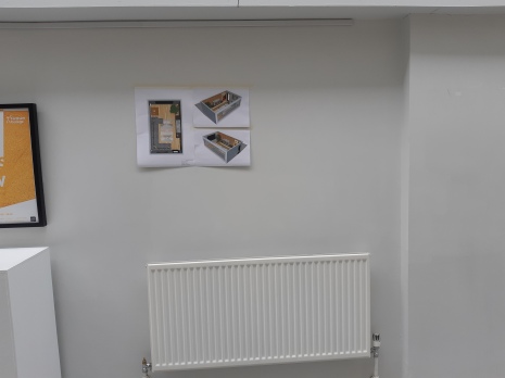
I will have them in the centre of the wall instead of off to the side. They will look different once they are printed A1 and A2. This has given me a rough idea of how my designs will look in the end. I am not certain where my artwork will go but I chose this wall purely just to see how my work might look. I ideally would like my work alongside someones who followed a similar theme, if not then I’m not fussed where my work goes.
